2025-08-08 — By Siddharth Jain · 5 min read
How to Build a Neumorphic CSS Button for Modern Web Apps
Buttons are among the most-clicked elements on any website or app. Their design affects usability, looks, and even how users feel when interacting with your interface.
This guide explains how to create a beautiful, neumorphic-inspired CSS button with smooth hover and press effects—and most importantly, how it all works.
✨ What is Neumorphism?
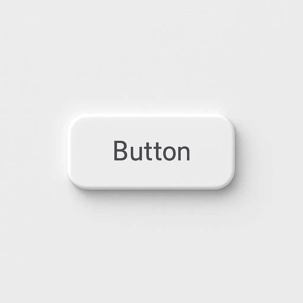
Neumorphism is a modern design style blending realism and minimalism. It uses gentle shadows and highlights for a subtle 3D, “soft extruded” look—perfect for making UI feel tactile and inviting without heavy gradients or flatness.
💻 Stunning CSS Button Code
Here’s the CSS for your button:
button {
  color: #090909;
  padding: 0.7em 1.7em;
  font-size: 18px;
  border-radius: 0.5em;
  background: #e8e8e8;
  cursor: pointer;
  border: 1px solid #e8e8e8;
  transition: all 0.3s;
  box-shadow: 6px 6px 12px #c5c5c5, -6px -6px 12px #ffffff;
}

button:active {
  color: #666;
  box-shadow: inset 4px 4px 12px #c5c5c5, inset -4px -4px 12px #ffffff;
}
HTML:
Click me
🛠️ Explained: How Each Part Works
Color & Font:
color: #090909;creates a crisp look, whilefont-size: 18px;ensures readability.
Padding & Border-Radius:
padding: 0.7em 1.7em;makes the button big and touch-friendly.
border-radius: 0.5em;adds smooth corners for a friendly vibe.
Background & Border:
background: #e8e8e8; border: 1px solid #e8e8e8;creates a soft, card-like surface.
Box-Shadow: -
6px 6px 12px #c5c5c5casts a subtle dark shadow right & down.-6px -6px 12px #ffffffadds a highlight top & left, mimicking raised surfaces.
Transition: Smoothly animates all changes in 0.3 seconds, enhancing tactile feedback.
🖱️ Interactive Pressed Effect
When the button is pressed (:active):
- Color shifts to
#666for visual feedback. - Box-shadow becomes “inset”—the effect reverses, making the button appear pressed in, just like a real pushable surface.
🚀 Try It Live
Just copy the above HTML and CSS into your web project or CodePen. Click the button to see the delightful press effect in action!
🎨 Design Tips
- Color schemes:
Changebackgroundand matching shadow tones for dark/light UIs. - Accessibility:
Adjust color contrast for readability and always provide focus states for keyboard navigation. - Customization:
Try differentborder-radiusvalues for more square or pill-shaped buttons.
✅ Why Use This Button Style?
- Modern: Looks fresh with current design trends (neumorphism, frosted UI, soft glass).
- Tactile: Shadows make it feel clickable even before hovering.
- Easy integration: Pure CSS and HTML—no dependencies or frameworks needed.