2025-08-01 — By Siddharth Jain · 7 min read
The Ultimate Guide to CSS Units, Positioning, and Display
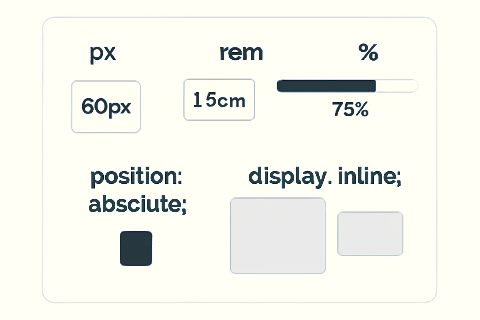
Modern CSS offers you a range of ways to size, position, and lay out your webpage elements. This guide breaks down what every CSS beginner should know about units like px, em, rem, %, the differences between display: block and inline, and how position: absolute works.
Let’s dive in step-by-step!
📐 Understanding CSS Units: px, rem, em, %
1. px (Pixels)
- Definition: A pixel is a fixed, absolute unit. It represents a dot on the screen.
- Use-case: If you set
font-size: 16px, it will always be 16 pixels on every screen. - Pros: Consistent size, good for icons and sharp borders.
- Cons: Not responsive to user’s font scaling or device zoom.
.title {
  font-size: 24px;
  margin: 10px;
}
2. rem (Root EM)
- Definition: rem stands for "root em". It’s relative to the root (``) element’s font-size.
- Default: Most browsers set
html { font-size: 16px }by default, so1remis 16px unless changed. - Use-case: Great for setting base font sizes, paddings, and layouts that scale with user preferences.
- Pros: Easy to make your whole site scale by changing root font-size.
- Cons: All rem values rely on that single root size.
body {
  font-size: 1rem; /* 16px by default */
}
h1 {
  font-size: 2rem; /* 32px (2 x 16px) */
}
3. em (Element Relative)
- Definition: em is relative to the element’s own font size (or parent’s font size if not set).
- Nesting: ems compound; if a parent is 2em and child is 1.5em, child is 2 x 1.5 = 3em in actual size.
- Use-case: Useful for buttons, spacing, or elements that should scale with their container.
- Pros: Lets child components flexibly scale.
- Cons: Can become confusing with deep nesting due to compounding.
.button {
  font-size: 1em; /* Same as parent */
  padding: 0.5em 2em; /* Padding relative to font size */
}
4. % (Percentages)
- Definition: Percent values are relative to the parent element's dimension (width, height, font-size, etc.).
- Use-case: Fluid layouts, responsive designs, scalable containers.
- Example:
width: 50%makes the width half of its parent’s width.
.container {
  width: 80%;
}
.child {
  width: 50%; /* 50% of .container's width */
}
5%specifically means 5 percent of the parent’s size.- If a parent is 1000px wide,
width: 5%means 50px.
- If a parent is 1000px wide,
🧭 CSS Position: absolute;
What does position: absolute do?
- Definition: Removes the element from the normal flow and positions it relative to the nearest parent with a
positionset (relative,absolute, orfixed). - Use-case: Creating overlays, dropdowns, tooltips, or placing items exactly.
- Properties: Use
top,right,bottom,leftto place the element. - Important: If no parent is positioned, it will be relative to the `` or the initial viewport.
.parent {
  position: relative;
}
.child {
  position: absolute;
  top: 20px;
  left: 20px;
}
Visual Example:
- If you want a badge at the top-right of a button, absolutely position it inside a relatively-positioned button wrapper.
🧱 Display: block vs inline
1. display: block
- Definition: Element starts on a new line and takes the full width available.
- Examples:
,,, - Behavior: Respects width, height, margin, and padding.
- Use-case: Layout containers, sections, cards.
.box {
  display: block;
  width: 70%;
  margin: 20px auto;
}
2. display: inline
- Definition: Element does not start on a new line; only takes as much width as its content.
- Examples:
,, `` - Behavior: Ignores width/height, only margin/padding left/right works.
- Use-case: Styling or highlighting short pieces of text inside a block.
.highlight {
  display: inline;
  color: orange;
}
3. Bonus: display: inline-block
- Combines benefits: behaves like inline (in text flow), but you can set width, height, margin, and padding.
👨💻 Practical Example
Absolutely Positioned! This is a highlighted word inside a block paragraph.
✅ Summary Table
| Unit/Property | Meaning / Relative to | Best Used For |
|---|---|---|
| px (pixels) | Exact, absolute (screen) | Icons, borders, fixed elements |
| rem (Root EM) | Root html font-size | Typography, site-wide scaling |
| em (Element EM) | Parent/element font-size | Buttons, component spacing |
| % (Percent) | Parent element's dimension | Responsive layouts, containers |
| position: absolute | Nearest positioned ancestor | Overlays, badges, tooltips |
| display: block | Starts new line, full width | Layout blocks, divs, sections |
| display: inline | No line break, auto width | Text styling within lines |
📝 Final Tips
- Use
remfor font sizes for accessibility. - Use
%for adaptable layouts. - Use
emfor responsive spacing inside buttons/components. - Use
position: absolutefor overlays, always within a relatively positioned parent. - Use
display: blockfor main content andinlinefor text, orinline-blockfor flexible components.