2025-08-02 — By Siddharth Jain · 7 min read
CSS for Beginners: Every Essential Topic Clearly Explained
Building beautiful, user-friendly websites starts with mastering CSS—the language of web styling. This practical guide covers all the foundational CSS topics you need, whether you’re a total beginner or looking to solidify your understanding.
🎨 What Is CSS?
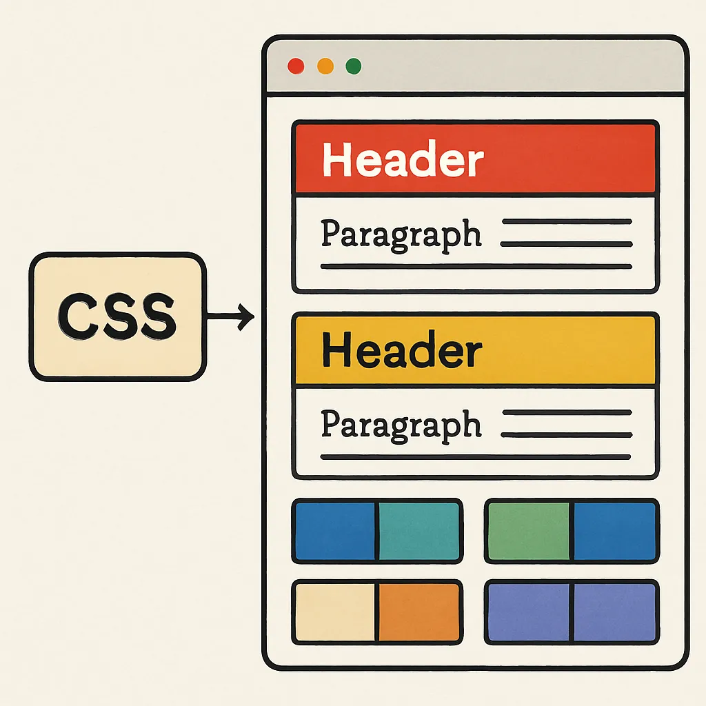
CSS (Cascading Style Sheets) describes how HTML elements will look and be displayed on screen or in print. It’s the tool behind colors, layouts, fonts, spacing, and responsive designs.
✏️ Why Learn CSS?
- Separates content and design: Keeps HTML clean and focuses on structure, while CSS manages styling.
- Endless customization: Change an entire site’s look with just a few lines of code.
- Critical for web careers: Every frontend developer, designer, or full-stack engineer uses CSS daily.
🛤️ Essential CSS Topics for Every Beginner
1. CSS Syntax and Selectors
- Syntax: CSS consists of selectors and declarations inside curly brackets.
Example:p { color: blue; font-size: 18px; } - Selectors: Target which HTML elements to style.
- Element (
p,h1) - Class (
.button) - ID (
#main-header) - Attribute, pseudo-class, and more.
- Element (
2. Color and Backgrounds
- Color: Use color names, HEX (
#3498db), RGB(rgb(52, 152, 219)), HSL.color: Text color.background-color: Element background.
- Background images:
background-image: url('image.jpg'); - Gradients:
background: linear-gradient(to right, #ff7e5f, #feb47b);
3. Fonts and Typography
- Font families:
font-family: Arial, sans-serif; - Font size:
Absolute (px) or relative (em,rem) - Font weight:
font-weight: bold; - Text alignment, line height, letter spacing:
text-align,line-height,letter-spacing
4. The Box Model
Every element is a “box” made of:
| Part | Description |
|---|---|
| Content | Text or image inside |
| Padding | Space around content |
| Border | Line surrounding padding |
| Margin | Space outside the border |
Example:
div {
  margin: 20px;
  padding: 10px;
  border: 2px solid #333;
}
5. Sizing and Units
- px: Absolute pixels (fixed size)
- em/rem: Relative to font size and root element
- %: Percentage of parent size
- vw/vh: Viewport width/height
6. Display, Positioning, and Layout
- Display types:
block,inline,inline-block,none - Position properties:
static,relative,absolute,fixed,sticky - Float and clear: Legacy layout methods.
- Overflow:
overflow: hidden/auto/scroll/visible
7. Flexbox and Grid (Modern Layout)
- Flexbox: One-dimensional layout (row or column).
display: flex;- Align and distribute space easily.
- Grid: Two-dimensional layout.
display: grid;- Control rows and columns for full-page layouts.
8. Borders, Rounded Corners, and Shadows
border: Control border width, style, and color.border-radius: Rounded corners.box-shadow: Add shadows for depth.- Example:
box-shadow: 0 4px 8px rgba(0,0,0,0.15);
9. Spacing: Margin and Padding
- Margins create space outside elements.
- Padding adds space inside the border, around content.
10. Lists and Links Styling
- Change bullet/number style with
list-style. - Style links using
:link,:visited,:hover,:active.
11. Responsive Design Essentials
- Media queries:
Change styles for different device sizes.@media (max-width: 600px) { ...; } - Relative units:
Use em, rem, %, vw, vh for fluid layouts.
12. CSS Variables and Custom Properties
- Define reusable values:
:root {
  --primary-color: #3498db;
}
.btn {
  background: var(--primary-color);
}
13. Animations and Transitions
- Transitions:
Smooth property changes.- Example:
button {
  transition: background 0.3s;
}
- Example:
- Animations:
Create sequences using@keyframes.