2025-08-03 — By Siddharth Jain · 6 min read
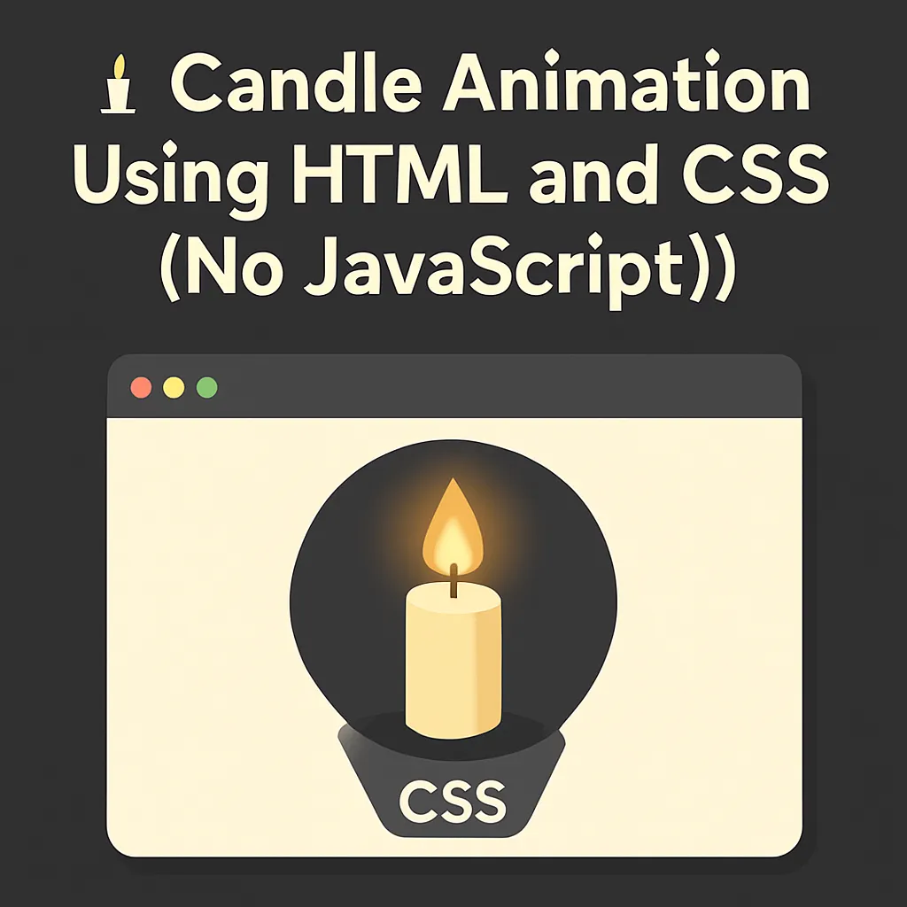
🕯️ Candle Animation Using HTML and CSS (No JavaScript!)
If you're looking for a creative, beginner-friendly project, building a candle animation using just HTML and CSS is a fun way to dive into frontend visuals. In this guide, we’ll create a realistic flickering flame with glowing effects — all without JavaScript.
🧱 1. Basic HTML Structure
We’ll start with a minimal structure. Each part of the candle — the body, wick, flame, and glow — is represented using nested div elements:
<body>
  <div class="candle-container">
    <div class="candle">
      <div class="wick"></div>
      <div class="flame"></div>
      <div class="glow"></div>
    </div>
  </div>
</body>
✅ Nesting allows each part of the flame to be positioned precisely using CSS.
🎨 2. Designing the Candle
🕯️ Candle Base
.candle {
  width: 80px;
  height: 200px;
  background: linear-gradient(to bottom, #f5f5f5, #e0e0e0);
  border-radius: 10px;
  position: absolute;
  bottom: 0;
  left: 50%;
  transform: translateX(-50%);
  box-shadow: 0 0 10px rgba(0, 0, 0, 0.3);
}
- The linear gradient gives it a 3D cylindrical look.
- Rounded corners make it feel soft and waxy.
🔥 3. The Wick (Top Stick)
.wick {
  width: 4px;
  height: 20px;
  background-color: #333;
  position: absolute;
  top: -20px;
  left: 50%;
  transform: translateX(-50%);
}
The wick is a simple vertical line centered on the candle’s top.
✨ 4. Flame Design
.flame {
  width: 30px;
  height: 50px;
  background: radial-gradient(
    ellipse at center,
    #ffeb3b 0%,
    #ff9800 50%,
    transparent 70%
  );
  position: absolute;
  top: -60px;
  left: 50%;
  transform: translateX(-50%);
  border-radius: 50% 50% 20% 20%;
  animation: flicker 0.2s infinite alternate;
  filter: blur(5px);
}
- Uses radial gradient for a realistic flame look.
animation: flickersimulates the flickering effect.blur(5px)softens the flame edges.
🌟 5. Glow Effect Around the Flame
.glow {
  width: 100px;
  height: 100px;
  background: radial-gradient(
    circle,
    rgba(255, 235, 59, 0.3) 0%,
    transparent 70%
  );
  position: absolute;
  top: -80px;
  left: 50%;
  transform: translateX(-50%);
  border-radius: 50%;
}
This gives a soft, glowing halo effect around the flame — enhancing realism.
🎞️ 6. Flicker Animation
@keyframes flicker {
  0% {
    transform: translateX(-50%) scale(1);
    opacity: 0.8;
  }
  100% {
    transform: translateX(-50%) scale(1.1);
    opacity: 1;
  }
}
- Adds subtle size and opacity changes.
- Makes the flame flicker realistically.
🧭 7. Body Styling for Centering
body {
  display: flex;
  justify-content: center;
  align-items: center;
  height: 100vh;
  background-color: #1a1a1a;
  margin: 0;
}
- Uses Flexbox to center the candle vertically and horizontally.
- The dark background highlights the flame.
📘 Breakdown of Key CSS Properties
🔍 Radial Gradient
background: radial-gradient(
  circle,
  rgba(255, 235, 59, 0.3) 0%,
  transparent 70%
);
| Component | Role |
|---|---|
circle | Circular gradient spread |
rgba(255, 235, 59, 0.3) | Soft yellow at the center |
transparent 70% | Fades into transparency |
➡️ Creates a smooth, realistic glow.
🔧 position: absolute and transform: translateX(-50%)
position: absoluteallows precise placement relative to the parent.left: 50%moves the element’s left edge to center.transform: translateX(-50%)shifts the element back by 50% of its width to center it exactly.
🔄 Negative top Values
- Used to move elements upward relative to their container.
- For example,
top: -80pxpushes the glow above the flame.
🔵 border-radius: 50%
- Applies a perfect circle shape to the glow.
✅ Project Summary
| Element | Purpose |
|---|---|
.candle | Candle body with shadow effect |
.wick | Thin stick at the top |
.flame | Bright, flickering flame |
.glow | Outer light around the flame |
flicker | Flame animation keyframes |
🔥 Now you’ve got a candle that flickers gently and glows — using just HTML and CSS!